|
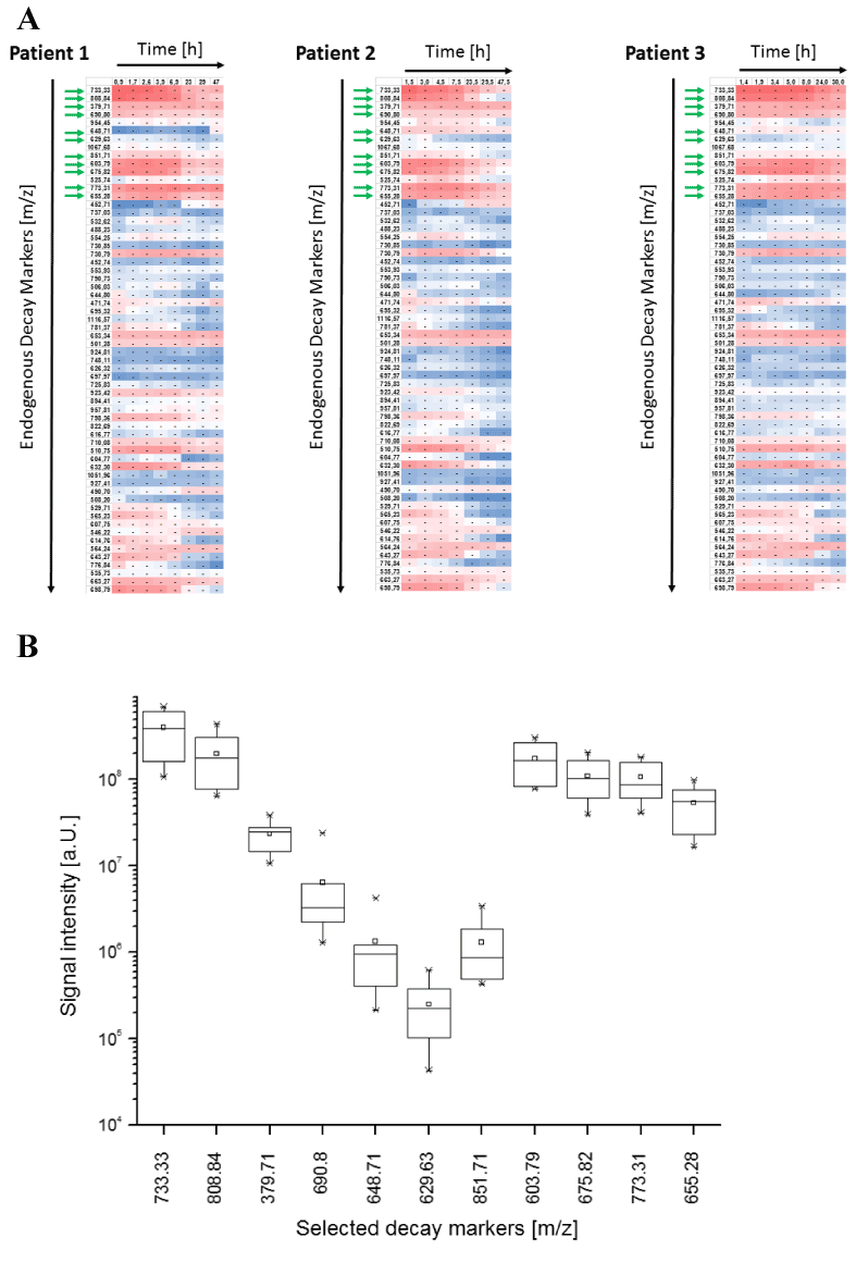
| Figure 2: A) Time dependent changes of 62 endogenous decay markers exemplarily shown for three patients. The heat map was generated with Excel 2013 software. The red color represents high signal intensity whereas blue color represents low signal intensity of the respective peptides. Green arrows indicate the subgroup of eleven decay markers that were selected for testing of analytical reproducibility (Figure 1) and interindividual variability (figure 2B). B) Signal intensities of eleven decay markers were extracted from 6 randomly chosen patients at 3h respectively. The line inside each box represents the median. The square inside each box represents the mean value. The limits of each box represent the 25th and 75th percentiles, and the whiskers represent the minimum and maximum values. Outliers are marked as asterisk. |