|
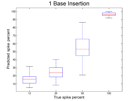
| Figure 6: True versus predicted spike fraction on the test data set created with a 1 bp insertion. This plot is typical of short insertions of other lengths. The X axis represents the predicted spike faction ˆp and the Y axis represents the actual spike fraction (12, 25, 50, or 100 percent). The average absolute error is 6.9 %, with the largest errors in the 50% and 25 % group. |