|
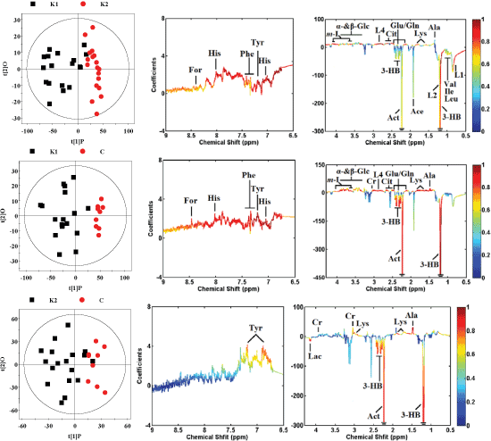
| Figure 3: OPLS-DA score plots (left panel) derived from 1H NMR spectra of serum samples and corresponding coefficient loading plots (right panel) obtained from the different groups. The color map shows the significance of variations in metabolites between the two classes. Peaks in the positive direction indicate that metabolites are more abundant in the groups in the positive direction of first principal component. Consequently, metabolites that are more abundant in the groups in the negative direction of first primary component are presented as peaks in the negative direction. |