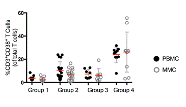
Figure 2:
Cumulative data comparing the percentage of CD3
+
CD38
+
cells (y-axis) between groups 1-4 (x-axis). PBMCs are depicted by dark circles and MMC by open grey circles. Red horizontal bars represent the mean per group examined.