|
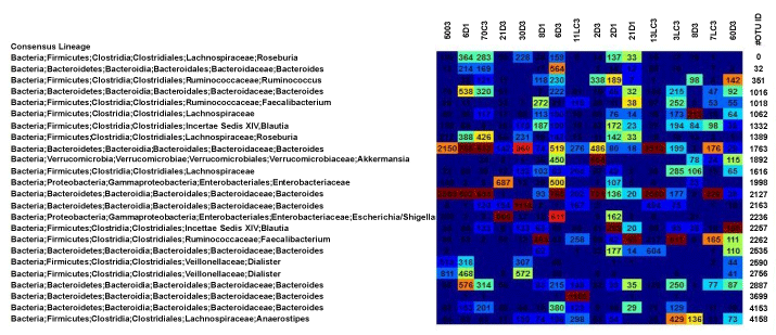
| Figure 3: Heatmap showing abundances within the 454 sequencing dataset between the groups and time points (OC – obese patients, LC – lean control; D1 – type 2 diabetics time point one; D3-type 2 diabetics time point 3) The OTU heatmap displays raw OTU counts per sample, where the counts are colored based on the contribution of each OTU to the total OTU count present in that sample, blue indicates contributions with low percentage of OTUs to sample, whereas red contributes for a high percentage of OTUs. |