|
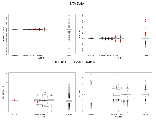
| Figure 4: Signal-to-noise diagnostic plot for the Tusher data under two transformations. Genes identified by SAM are highlighted in red. The horizontal axis is the binned gene specific variances. The vertical axis for the plots in the left column is the average expression across the two groups (abundance) while it is the the average difference in expression (signal) for the right column. Conjugacy appears appropriate for the raw data, and an independence relationship appears appropriate for the transformed data. |