|
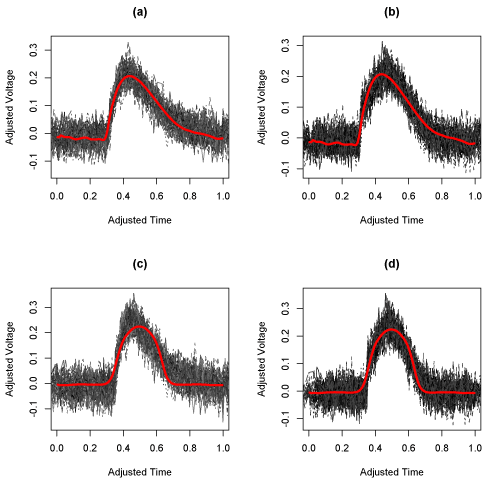
| Figure 5: Results for simulated dataset. The four panels show the functions assigned to each group versus the fitted curves for g1 and g2. The diagonal panes (a) and (d) show the functions assigned to the corresponding g (e.g. the functions assigned to group 1 with g1 overlaid, and the functions assigned to group 2 with g2 overlaid). In contrast, the off-diagonal panes in (b) and (c) correspond to the functions overlaid with the "other" g (so the functions assigned to group 1 with g2 overlaid, and the functions assigned to group 2 with g1 overlaid). |