|
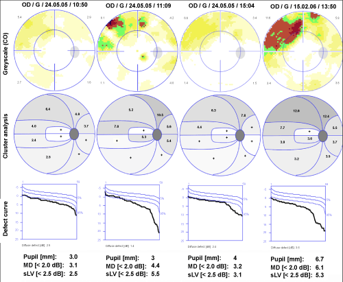
| Figure 7: The overview shows the colour scale of comparison (with white color reflecting age matched normality, darker colors presenting an increasing deviation from normal sensitivity), cluster graph: numbers and grey scales, reflecting the deviation from normal in dB, and the cumulative defect (Bebie) curve. The columns from left to right summarise: normal strategy (NS); pulsed RAMP strategy; calculated reference field; next follow-up field (NS). |