|
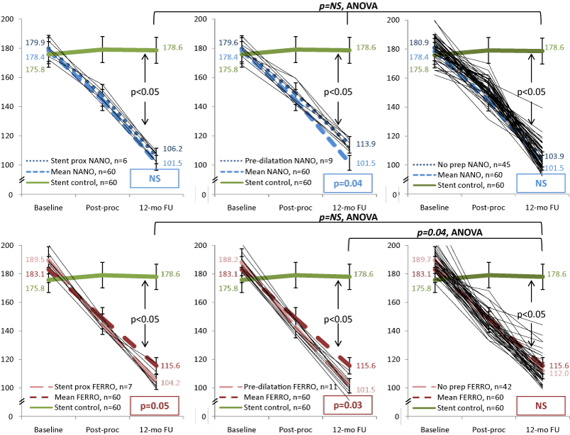
| Figure 4: Results of the 1-year imaging follow-up: reduction of the total atheroma volume. Three curve charts at the top show changes in total atheroma volume at three subsets of Nano group. Individual curves for each subject are provided. Charts at the bottom demonstrate dynamics of atheroregression in Ferro group. All charts present curves (1) at the subset, (2) mean of the entire population of the group, and (3) stenting control. |