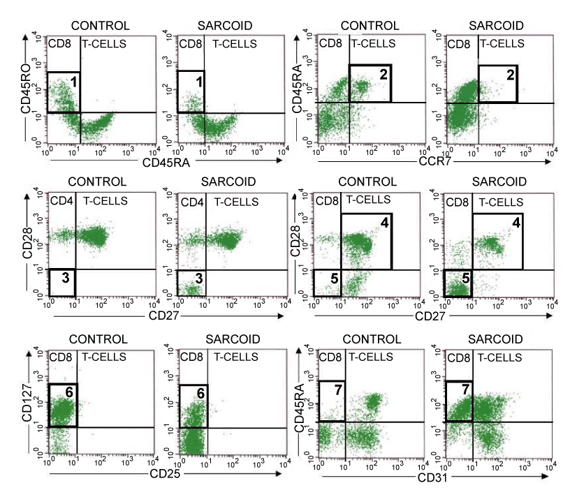
Examples of the T cell populations are labelled 1-7, referring to the results listed in table 3. The associated population is highlighted with a bold black rectangle. 1: CD3+ CD4- CD45RO+ CD45RA-. 2: CD3+ CD4- CD45RA+ CCR7+. 3: CD3+ CD4+ CD28-CD27-. 4: CD3+ CD4- CD28+ CD27+. 5: CD3+ CD4- CD28- CD27-. 6: CD3+ CD4- CD25-CD127+. 7: CD3+ CD4- CD45RA+ CD31-.