|
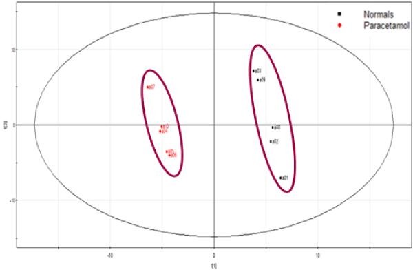
| Figure 8a: PLS-DA plot for variations seen between control (normal) samples and those spiked with paracetamol standards at different concentrations. The external standards and QC samples are not plotted for the ease of graphical representation. The X-axis represented t [1] which shows score t [1] for PC1 showing maximum variation in the dataset. The Y-axis represented t [2] which represents score t [2] for PC2 showing maximum variation not seen from just PC1. |