|
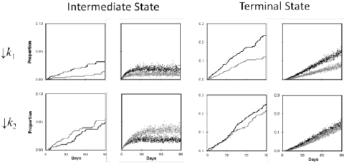
| Figure 3: A three-state dynamical vs a two-state stochastic model. The graphs summarize the statistical analysis of a hypothetical randomized clinical trial(HARI). The left panel of each pair illustrates conventional Kaplan-Meier curves. The black line is for the control group and the grey line is for the treatment group.The right panel of each pair illustrates analogous curves derived from a dynamical analysis of the same data. As in Figure 1, the points represent 1000 randomlog normal resamples of the rate constant and time-to-event data. The black points represent the control group and the grey points represent the treatment group.The top row illustrates the analyses based on a 50% reduction in k1 (transition from the initial to the intermediate state). The bottom row illustrates parallel analysesbased on a 50% reduction in k2 (transition from the intermediate to the terminal state). The comparative analyses of these data are summarized in Table 2. See textfor discussion. |