|
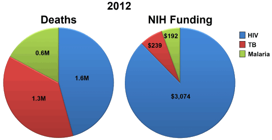
| Figure 1: NIH funding for HIV, TB, and malaria. Pie charts represent the approximate proportion of deaths (in millions; left pie) and the level of NIH funding (in millions; right pie) for HIV (blue), TB (red), and malaria (green). Data is based on the Estimates of Funding for Various RCDC, Global Tuberculosis Report 2013, World Malaria Report 2013, and the Global Report: UNAIDS Report on the Global AIDS Epidemic 2013. |