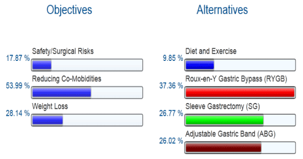
The aggregated preferences of the objectives of treatment for the study population as a whole are expressed as percentages. The percentages for the alternatives represent the collective proportion of choice for the entire group to obtain their preferred objects. This graph is derived from Program print-out.