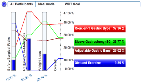
This graph shows the ability of the different alternatives to meet each objective based on the utility curves which accounted for the historically success rate of each treatment option. This graph is derived from Program print-out.
|
| Figure 3: Performance Sensitivity Graph. This graph shows the ability of the different alternatives to meet each objective based on the utility curves which accounted for the historically success rate of each treatment option. This graph is derived from Program print-out. |