|
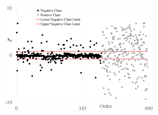
| Figure 2: An example of the SM. This test data set is for Breast. The values of x0 are plotted for negative class (black filled circles) first and then for the positive class (gray filled circles). The red lines are the upper and lower limits for being classified as belonging to the negative class. Thus, values inside the red lines are classified as belonging to the negative class and values outside the red lines are classified as belonging to the positive class. The percent of total variation for this PC is 8.6%. |