Colour as a Tool to Create Graphical Statement
Received: 16-Dec-2013 / Accepted Date: 05-Feb-2014 / Published Date: 13-Feb-2014 DOI: 10.4172/2168-9717.1000119
Abstract
Graphics was a two dimensional notion till the nineteenth century. It was only in the twentieth century, during the modern movement, that graphics emerged as a three dimensional tool. During the same time architecture also had a change in its definition and there was a breakthrough in the design industry. Colour which was earlier used as a superficial element for decoration now started being used as a design element of third dimension in architecture.
Designing with colour therefore it must be considered in all its aspects of which are related to one another, so that virtually in any work in which colour plays a role all must be taken into accent. Colours have a profound effect on mind and emotion and influence our mood and feelings. Colour can reinforce ideas of form and material; express its divisions and proportions.
Colour can underline an architectural statement, it can punctuate, direct and focus attention and compensate in a way unlike any other abstract element”. How graphical use of colour can create a statement in architecture.
Keywords: Art; Architecture; Design
74305Introduction
Colour and its source
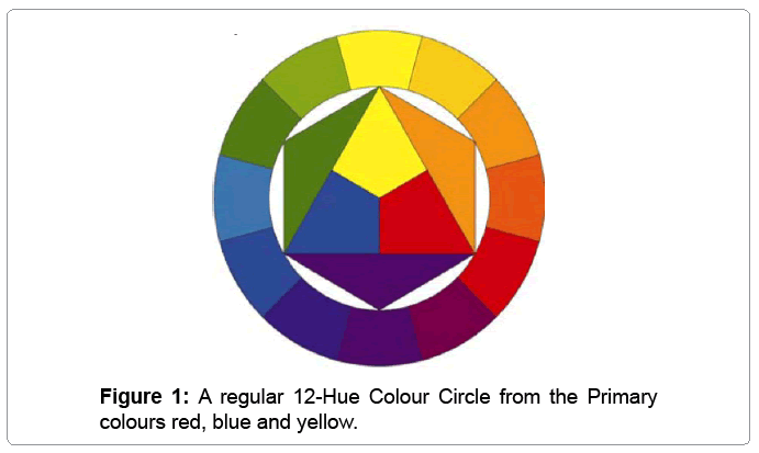
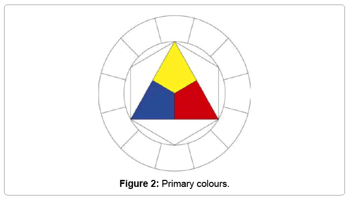
Light is the source of colour. Colour is the impression received by the mind from certain stimulations of the retina. Colour perception occurs because objects reflect or transmit light, which enters the eye, acts upon the optic nerve, and causes the sensation of light and colour in the brain. Light rays or waves which vary in length and rate of vibration produce different sensations and appear as different colours. There is an optical instrument known as spectroscope which breaks up or decomposes light and reveals the fundamental colours as arranged in the spectrum. At one end of the spectrum there is the violet colour which has the shortest visible waves; at the other end is red, which has the longest visible rays [1]. The other colours are produced by the intermediate waves. Objects are usually able to reflect part of a light beam and absorb other parts. For example, if an object appears green it absorbs all the other colours that make up while light and reflects only green (Figures 1 and 2).
Colour Terminology
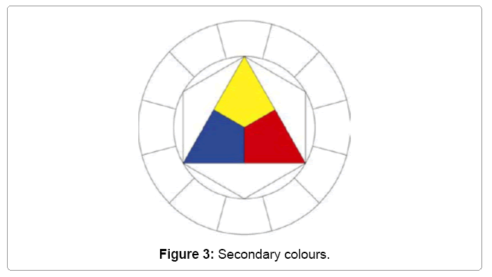
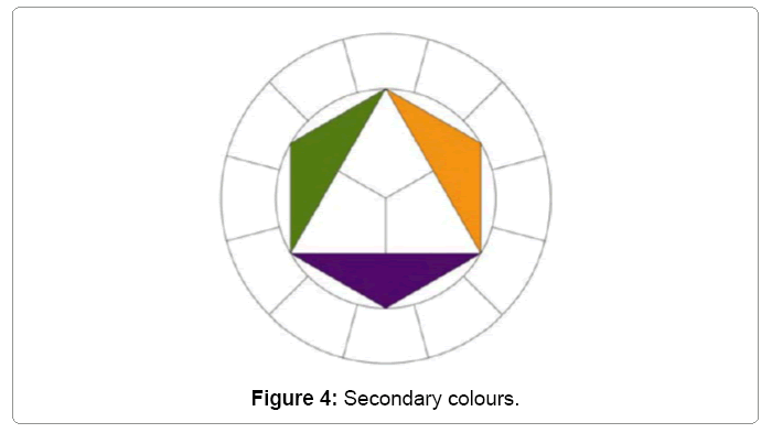
The terminology for the colours are explained below: (Figures 3 and 4)
Hue: Hue is the quality we commonly label by the names of the so called primary color-red. yellow and blue which are not the results of any mixture. These are primary hues and theoretically the basis for mixtures resulting in orange, green and violet and, therefore they are called secondary colors.
Value: Value refers to the lightness or darkness of a color. As white Is added the color becomes “higher” in value until pure white is reached, converse as, black is added, or some other color a which has a darkening effect, the value becomes “lower” until pure black is reached.
Chroma: Chroma describes the brilliance or intensity of a color. Bright color, such as yellow and orange has high chroma (i.e. intensity). White, violet and blue, which are more muted colors, have a low chroma [2].
Colour and its emotional effects
Color, has its emotional effect on humans. It is capable of soothing or irritation, cheering or depressing, charming or boring, welcoming or repelling. A color changes in emotional value, if its hue, value or intensity is changed. Different colors because different emotional responses and some persons are more sensitive and more stimulated.
• Yellow stands for cheerfulness, gaiety, buoyancy, optimism, exultation, sympathy and ever prosperity. It almost signs and shouts. It is indispensable, because more than any other color it gives the effect of light.
• Red is the color of fire and blood. It is expressive of primitive, passion, war, vigor, power, movement, aggression, boldness and love. Intervention of red color in interiors gives the impression of splendor, warmth, hospitality and exhilaration. It is careful, but not restful and so must be used discreetly.
• Blue is the color of skies and deep water, and so is associated with coolness It expresses distance, spaciousness, loftiness, dignity calmness, serenity, reserve, formality, restraint, lack of sympathy and coolness.
• Orange is the most vivid hue that exists. It possesses the qualities of both red and yellow and in its pure state it is so warm that it should be used only in an appropriate scale and proportion. It expresses energy, spirit, hope, courage and cordiality.
• Brown is that most useful of colors is for traditionalist, humility, tranquility and gentleness.
• Purple is made of red and blue, which possess quite opposite characteristics and when mixed nullify each other’s effect, so that purple is somewhat gentle and vague. It suggests mystery, dignity, reflection, mowing,
• Philosophical nursing and twilight.
• Green is the color of grass, leaves and vegetables and naturally suggests rest, cool, shade and refreshment, all pleasant things. Green is considered beneficial to the eyes, nerves and disposition. Some colorist says that green has negative as well as positive and that it suggests envy, jealousy and ill health.
• Black suggests mystery, wisdom or sophistication and in graphics it can be employed to create dramatic or other extreme effects. Also it adds spirit and interest, even a small touch of black gives a bold statement.
• White is a color of peace and serenity, sometimes it expresses luxury, delicacy and felicity.
Gray is produced by mixing black and white has no particular character of its own, although in light tints it seems gentle and serene and in dark shades dignified and restrained. Grays may be warm and cool.
Psychological Effects
The psychologist is interested in problems of the influence of colour radiation on our mind and spirit. Colour symbolism, and the subjective perception and discrimination of colours, are important psychological problems.
Warmth and coolness
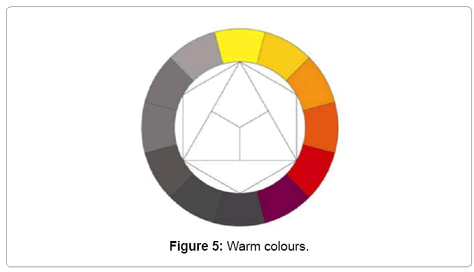
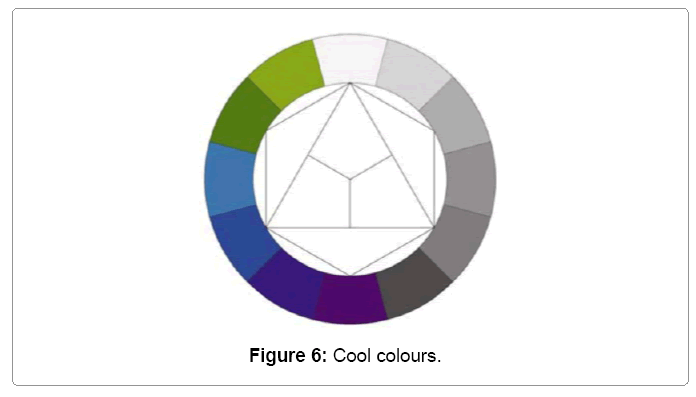
One of the most important qualities of color to be considered in designing is its warmth or coolness. Colours that contain much yellow or red are considered to be warm; those contain a preponderance of blue are regarded as cool, green is often likely to be warm, a blue-green is cool. A red-purple may be warm and a blue purple cool. We probably attribute warmth or coolness to colors because of their associations with objects that have warmth or coolness. Yellow and red seem warm to us because they are the color of sunshine, artificial light, and fire. Blue and green suggest coolness because we associate them with shies, water, ice and foliage. Warm colors seem to advance hence cool colors tend to recede [3]. This illusion results not only because of association, but also because the wave lengths at the warm end of the light spectrum are “stronger” that is, more visible then those at the blue-violet and ultraviolet, of course, cannot be seen at all (Figures 5 and 6).
Heaviness and lightness
Studies are being made by psychologists concerning the apparent weight or lightness of colors. Colorists agree generally that blue and purple are the lightest in weight of all colors. Green seems a little less heavy than red and yellow, which are the heaviest. When the colors are grays they tend to become a light in weight.
Visual effects of colour application
Discovery of relationships, mediated by the eye and brain, between colour agents and colour effects in man, is a major concern to the art is the problems of subjectively conditioned colour perception are especially pertinent to art education, architecture and commercial design.
Advancing or receding colour
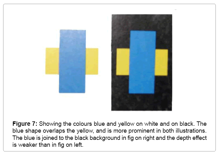
Advancing and receding qualities in colours are proven. The warm hues seem to advance and cool ones to recede. The most strongly advancing colour is yellow, then orange, red, green, violet, and last blue. Intense colours advance more than grayed ones. Artists, who paint logically for visual effects, use this quality of colour (Figure 7).
In building interiors, advancing warm colour makes the space seem smaller and advancing cool colours make the space seem bigger. If a dark hue or shade is used horizontally on a vertical building, it gives a sense of weight and grounding. Similarly if light coloured pillars are used with a dark background the pillars from a distance give a freestanding effect. Also a floating effect can be achieved by using light colour exteriors for a darker environment. Thus colour used as a space and form modifier.
Emphasis or Legibility
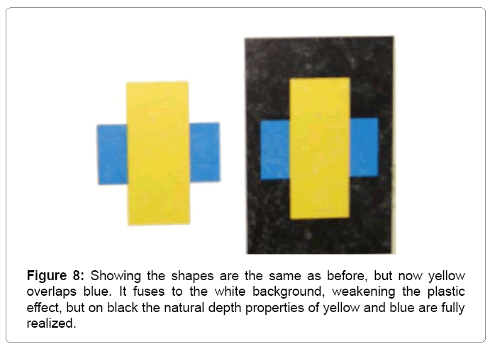
Legibility is the capability to read the form clearly against its background. Visibility depends on contrasts. By the use of the quality of contrasts of colours, it can be used to highlight or make legible (Figure 8).
Camouflage
The very opposite use of highlight is camouflage. The colours can be used to make objects as subtle as possible or in order to change their apparent shape, size and identity.
Colour harmony
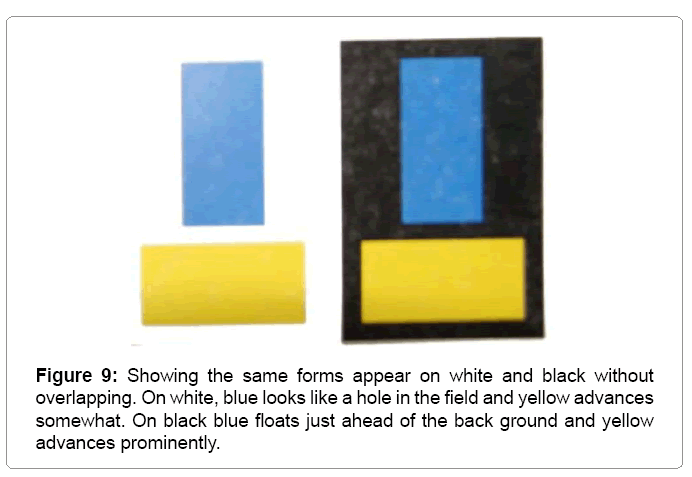
Harmony can be defined as a pleasing state of things in general and of their properties; congruity of parts with one another and with the whole. It implies balance, symmetry of forces. When more than one colour comes into play, it’s more of a knitted whole, in which each separate colour, like a member of a living body, has its place and function through the alliance in which it finds it self; also in its appearance it is so very defined that one would hardly recognize it again, meeting it in another combination. So colour harmony can be associated with visual order, visual proportions, visual balance and visuals ymmetry. All the sevisual qualities of colour can be used to create graphic statements and so colour can be used as a tool for graphical perception. When considered in terms of architectural composition, colour can underline an architectural statement; it can punctuate; direct; focus attention and compensate in away unlike any other abstract architectural element (Figure 9).
Colour graphics
Communication strategy, the essence of graphic design, can be jeopardized by poor color choice. Because written words register in the viewer’s brain after it responds to color, strong choices are intrinsic to a great design. Although on a functional level it creates reflectivity, visibility, contrast, and enhances legibility, color can and should also be used to entice people, enhance a concept, twist a message, or convey a feeling or emotion.
As designers, we have been exposed to color theory, but we may find it difficult to expand our theoretical understanding into the realm of practical use. Although we may understand that a composition based on a pair of complements will create harmony, we may not understand which pair will increase the communicative powers of the design. In the same fashion, proportional balance between colors is obvious, but it is the way we manipulate the relationship to create the balance or imbalance that adds to or takes away from the design. Standard theory suggests that all colors mixed together become gray, but it takes more sophistication to see that the combination could be used to represent the blending of two corporate organizations.
Although choosing simple color palettes might be second nature, correctly choosing a color scheme that will evoke calmness or anxiety may be more difficult to ascertain. Because color communicates, we must be concerned with what our choices are communicating. An increased understanding of people’s response to certain colors, both nationally and abroad, would help us to convey our message on a psychological or emotional level.
A sophisticated design person can use color to his or her advantage by understanding the implications that it has beyond attractiveness that supports a design strategy. Although one cannot provide the years of experience and training that it takes to develop the finesse involved in color application, one can present examples of what one consider tobe interesting and creative color solutions to various design problems. Some of the examples in which Color Graphics provides with ways to learn to appreciate and use color to support work are as below, each with some examples for easier and better understanding.
Colour that can influence
In our visually boisterous world, color is the key element that can be used to catch the viewer’s attention. Whether bright or dull, singular or complex, physiological or psychological, theoretical or experiential, the persuasive power of color attracts andmotivates a design.
Although some colors produce an intrinsic physiological response—such as the way red increases your heart rate—most color response is due to experience and association. Persuasive color distinguishes one object from another, identifies the object, or helps to associate the object. Often, positive color associations increase the comfort level of the viewer. Like with the help of colour graphics in the designing of the of Cici’s Pizza, designed by Design Forum, red and green are intentionally used to create an association with Italy and convey the idea of good Italian food. In addition to association, color can be used to identify. In the case of the Soho Spice restaurant in London, designed by Lewis Allen of Fitch, regional colors of India were used to identify the restaurant with its country of origin. The colors of Indian spices were also incorporated into the design. The spice colors create a taste-smell-visual association. The color allows people to see the taste and smell of Indian food.
Examples Explained for Colour in a Graphical Statements
The following are the examples explained for the Graphical Statements:
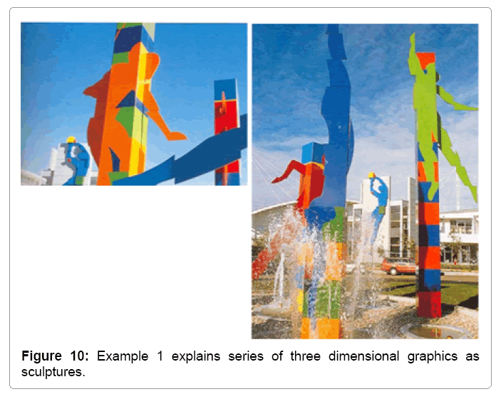
Example 1
Project description: The Melbourne Sports and Aquatic Centre, a large sporting venue, needed exterior graphics that indicated an atmosphere of fun, yet the organization was very budget conscious.
Project concept: Cato Purnell Partners developed a series of three dimensional graphics as sculptures, even one including a fountain, in a palette of lively colours that leaves little doubt that this is for fun.
Colour design: Clean, primary colour were used to create atmosphere vitality. Geometric patterns of colour allow one-colour sports figures in action to stand out, whereas the three dimensional aspects of the sculpture gives the figures movement and persuades passersby that this place offers plenty of action.
Colour that changes the perspective: Because the designer wants to alter the viewer’s Perception, color that changes a person’s perspective is perhaps the most difficult and creative use of color in graphic design. It is difficult because the color acts as the antagonist for the change in perception and is integral to the strategy of the piece. It is the relationship between what is expected and what is actually presented that creates interest and excitement.
Color that changes your perspective can be at the basis of the design strategy. For example, VIA used gray in the gofish.com logo to suggest a mixing and a union—rather than a transaction—between the buyer and the seller.
“Incorrect color” was also used by Cahan and Associates in the Consolidated Paper book on annual reports in which green chapter heads replace corporate blue. The book itself has a chapter on corporate blueness, showing the intended choice of green. It is through that intentional manipulation of color that color changes a person’s perspective (Figure 10).
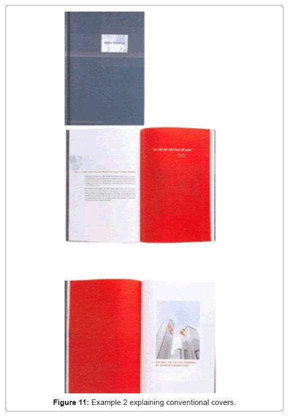
Example 2
Project description: McKee Nelson, specialists in tax law, needed a new capability brochure that set them apart from other law firms of their kind and highlighted their wealth of experience in this specialty.
Project concept: According to designers, lawyers at McKee Nelson are able to see things that most law firms might not because of their extensive experience. They decided to turn this selling point into a visual presentation that would be memorable and a departure from traditional marketing materials circulated by the legal profession.
Colour design: “We decided to visually emulate this point by using translucent red flysheets within the brochure to hide and reveal copy and images underneath,” explains Jonathan Amen. So, while superficially, the brochure looks like many others from its conventional blue-gray cover, once inside, shocking red flysheets greet the reader.
Colour message: The bold, graphic appearance of color used to convey a primary message clarifies, enhances, and define images to get the point across fast. Often these colors imply a functional message as red, green, or yellow traffic lights and signs or have an everyday, natural association such as grass green or sky blue. For Ljubljana Waterworks, Edi Berk used blue to identify and create a common association that people make with water. Green was also used as identification with land. In addition to these, types of industries, groups of people, or age groups can be identified through certain color choices. Primary colors or pastels are used quite successfully when it comes to children’s and related industries. Merzler and Associates used primary colors in a logo for Smobey’s a manufacturer of children’s toys to create an association with children (Figure 11).
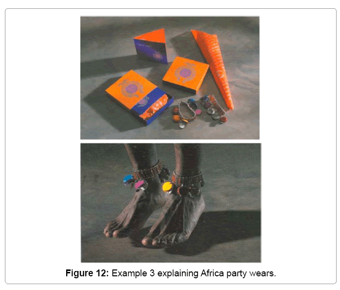
Example 3
Project description: Oracle retained Cross Colours to develop an invitation for the company’s 500,000 satellite subscriber party themed Rhythms of Africa.
Project concept: Designers sought inspiration for the Rhythms of Africa party invitation from South African jewelry created by miners who traditionally attach bottle tops to a wire, which they fastenover their gumboots to create a rattle for a celebratory dance.
Colour design: Inspiration for the color palette came from the African landscape and its people. Yellow, pink, and blue bottle tops were enclosed in a vibrant orange and purple packaging (Figure 12).
Conclusion
This research aimed for making color as a tool to create graphical statement explains how colour has been used in graphics to communicate a statement through abstraction, but it is all two dimensional. To understand how colour is used in architecture in the similar manner it is important to understand its transformation of utility from 2D to 3D. Colour graphics is a work in printing and painting of architecture which is always related to understand the intervention and transformation of colour graphics from 2D to 3D architecture. However we need to study the relationship of painting and architecture which has its roots in the 20th century.
References
- Mulvey F (2012) Review of Graphical Perception of Space. Francesco Cara.
- Robert S (1969) Personal space: the behavioral basis of design, Prentice-Hall, EnglewoodCliffs, New Jersey.
Citation: Patel T (2014) Colour as a Tool to Create Graphical Statement. J Archit Eng Tech 3: 119. DOI: 10.4172/2168-9717.1000119
Copyright: ©2014 Patel T. This is an open-access article distributed under the terms of the Creative Commons Attribution License, which permits unrestricted use, distribution, and reproduction in any medium, provided the original author and source are credited.
Select your language of interest to view the total content in your interested language
Share This Article
Recommended Journals
Open Access Journals
Article Tools
Article Usage
- Total views: 15211
- [From(publication date): 3-2014 - Jun 24, 2025]
- Breakdown by view type
- HTML page views: 10639
- PDF downloads: 4572

