John Hopkins got Incidence Rate Wrong: A Close Look at John Hopkins University's Web-based Interactive Dashboard for Real-time Tracking of COVID-19
Received: 01-Jul-2022 / Manuscript No. jcmhe-22-68294 / Editor assigned: 04-Jul-2022 / PreQC No. jcmhe-22-68294 (PQ) / Reviewed: 18-Jul-2022 / QC No. jcmhe-22-68294 / Revised: 25-Jul-2022 / Manuscript No. jcmhe-22-68294 (R) / Published Date: 01-Aug-2022 DOI: 10.4172/2168-9717.1000763
Abstract
Since the beginning of the pandemic, the world has registered more than 250 million confirmed cases and more than 5 million deaths. A web-based interactive dashboard with real-time hosted data was developed by the John Hopkins University Center for Systems Science and Engineering (CSSE) to provide researchers, public health officials and the general public with an easy to use tool to visualize and track the pandemic as it unfolds around the world. The incidence rate is a measure of events that represents the transition between two states, not from disease to disease, so it is an estimate of risk. When looking at the aforementioned incidence rate that is reported for Angola and other countries, we note that the observation period in which the incidence rate is calculated and presented in the Panel is missing or not clearly defined, although the choice of this element is entirely arbitrary, but must be clearly defined in the calculation. The panel considers as new cases all cases from notification of the first confirmed case (March 21, 2020 in the Angola example) to the review date (Nov. 30, 2021). In our view, it is completely irrelevant to estimate the risk of a potentially epidemic disease over long observation periods, as presented in the panel when the objective is to allow decision making to control and assess the pandemic by public health authorities. We think that it would be entirely sensible and convenient to present this indicator in short observation periods of a maximum of 28 days and a minimum of 7 days.
Keywords: Incidence rate; Covid-19; John Hopkins University Interactive Dashboard
Abbreviations
(COVID-19) Coronavirus Disease; (CSSE) Center for Systems Science and Engineering; (MD) Medical Doctor; (SARS-CoV-2) Severe Acute Respiratory Syndrome Coronavirus-2; (USA) United States of America
Introduction
From the start of the pandemic until yesterday (November 30, 2021) at 19:22 the world recorded a total of 262,504,239 confirmed cases and 5,212,595 deaths caused by the SARS-CoV-2 virus, which was initially identified in December 2019 in Wuhan (Hubei, China) [1,2].
In order to provide researchers, public health authorities and the general public with an easy to use tool to visualize and track the pandemic as it unfolds around the world, a web-based interactive dashboard with hosted real-time data was developed by the Center for Systems Science and Engineering (CSSE) at Johns Hopkins University, Baltimore, MD, USA [3,4].
It is not within our scope to address all aspects of this powerful data collection and visualization tool, and we will limit ourselves only to providing our opinion regarding the calculation of the incidence rate that is presented in this panel. Additional information can be found here (https:// www.thelancet.com/journals/laninf/article/PIIS1473-3099(20)30120-1/ fulltext) [5-7].
Incidence Rate-Review of the view by Leon Gordis, Professor Emeritus of Epidemiology, Johns Hopkins University Bloomberg School of Public Health
In his prestigious book on Epidemiology, Professor Leon Gordis gives us a classic definition of incidence rate:
"The incidence rate of a disease is defined as the number of new cases of the disease that occur during a given period of time in a population at risk of developing the disease [8]."
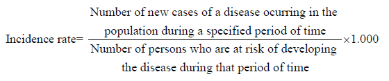
In the formula above, we arbitrarily use the population constant of 1.000. Here, we would like to recall that the incidence rate is a measure of events that represents the transition between two states, not from disease to disease, and for this reason it is an estimate of risk [8].
As we look at this mathematical formula, Professor Leon Gordis points out in his book that the crucial element in calculating the incidence rate lies in the numerator, that is, in the new cases. For us this makes perfect sense, since it is necessary to differentiate from this point onwards the occurrence of new cases of disease in the population from the existence of cases of disease in the population in a given period. This point demarcates the relationship between the incidence rate and the prevalence rate.
Another no less important aspect present in this formula that contextualizes the estimation of the risk of the emergence of new cases of the disease in the exposed population is the period of observation of the event. This is explicitly defined in both the numerator and the denominator. Professor Leon Gordis points out that the observation time must be clearly defined in the calculation [8].
For us it doesn't Make Sense!!!
So let's now look at the incidence rate calculation that is presented on the interactive, web-based dashboard to track COVID-19 in real-time from John Hopkins University.
Observing the figure below, we can see on the panel's incidence tab the different incidence rates of COVID-19 with distribution on the world map. The time taken to extract the data from this analysis can be seen on the left of the panel, with the information on the last update date being November 30, 2021, at 19:22.
For the specific case, we selected Angola which is presented with an incidence rate of COVID-19 of 198.24 per 100,000 inhabitants.

Figure 1: Incidence rates of COVID- 19 with distribution on the world map
We can also see in the figure below the panel terms of use guide.

Figure 2: Panel terms of user guide and the definition of incidence rate
We are calculating the incidence referring to which time course?
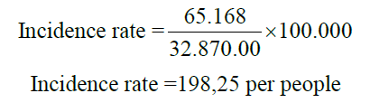
When looking at the aforementioned incidence rate that is reported for Angola and other countries, we note that the figure presented is justified by taking the totality of cases divided by the population per 100,000 inhabitants. Let's look at the case of Angola:
If we notice, we will see that the observation period in which the incidence rate is calculated is missing or not clearly defined, although the choice of this element is totally arbitrary, but it must be clearly defined in the calculation. New cases are then considered here from notification of the first confirmed case (March 21, 2020) to the review date (Nov. 30, 2021). For access to data sources and time series visit the Johns Hopkins University Center for Systems Science and Engineering (CSSE) COVID-19 data repository on the github [9].
If one of the objectives of creating this tool is to provide public health authorities with the facility to track and monitor the outbreak as it develops, thus supporting decision making for the adoption of control and mitigation measures against the COVID-19, in our opinion, it is completely irrelevant to estimate the risk of a potentially epidemic disease in long observation periods, as presented in the panel. Therefore, remember that Professor Leon Gordis states that the goal of calculating incidence has its purpose in enabling us to carry out valid comparisons with necessary information present both for the numerator and for the denominator of the formula [8].
We think that it would be entirely sensible and convenient to present this indicator in short observation periods of a maximum of 28 days and a minimum of 7 days.
Why Calculate in Short Periods?
Because the panel itself presents, in addition to the total number of cases and deaths, also totals of 7 and 28 days. This allows for a comparison of the current and opportune time for the assessment by policy makers of the evolution of the risk of new infections in the population and the impact of preventive measures adopted or to be adopted.
COVID-19 incidence rate-redoing you calculations in 7 and 28 days
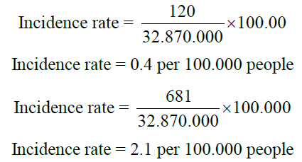
Let us now look at the incidence rates in these observation periods for Angola, 7 and 28 days respectively:
Discussion
As noted, the incidence rate corresponding to the 48th epidemiological week was 0.4 per 100,000 inhabitants and the incidence rate corresponding to the period from November 3 to 30, 2021 was 2.1 per 100,000 inhabitants (Figures 3 and 4). Even so, these isolated values have almost no relevance, but if we compare with previous homologous periods, the extracted information gains relevance for those who need to assess and monitor the evolution of new infections and define control and prevention measures and their effectiveness. If we limited our analysis to the comparison of the evolution of the incidence rate of COVID-19 in two periods of 28 days, as shown in Figure 4, without considering a shorter period as in Figure 3 we would have an analysis distortion without realizing that although there is clearly a decreasing trend in the number of new cases of COVID-19 between the two 28 day periods visualized in Figure 4, there is also a growing trend, albeit one tenth of the emergence of new cases between the 47th and 48th epidemiological week. This insight adds added value to our analysis. Therefore, due to the characteristics of the infection dynamics of the SARS-CoV-2 virus, which causes the COVID-19 disease, in our opinion this type of analysis, would be more useful for public health authorities if performed in short periods of 7 days.

Figure 3: COVID-19 weekly incidence rate in Angola

Figure 4: Incidence rate of COVID-19 in two comparative 28-day periods in Angola
Conclusion
The incidence rate displayed on the John Hopkins University's webbased interactive dashboard to track COVID-19 in real-time loses its usefulness or relevance as a measure of risk estimation as it is calculated. However, this is not a finished discussion.
Recommendations
Based on the above, we recommend that the COVID-19 incidence rate be better defined and that it be calculated and presented in the panel in periods of 7 and 28 days.
Ethics Approval and Consent to Participate
Not applicable.
Consent for Publication
Not applicable.
Availability of Data and Material
Data supporting our findings can be found at the following link https:// github.com/CSSEGISandData/COVID-19.
Competing Interests
Not applicable.
Funding
Not applicable.
Author's Contributions
Santland Sebastião Alberto de Lemos
Conception of the work, texts/data delivered its writing or critical review, approval of the final version.
Paulo Ney Solari
Analysis and interpretation of the texts/data provided their writing or critical review, approval of the final version.
Acknowledgements
We would like to thank Professor Ferreira Alberto de Lemos for his contribution to the translation of the manuscript into English.
References
- COVID-19 Map (2021) Johns Hopkins Coronavirus Resource Center.
- Weekly epidemiological update on COVID-19-30 November 2021. (2021) WHO.
- Dong E, Du H, Gardner L (2020) An interactive web-based dashboard to track COVID-19 in real time. Lancet Infect Dis 20(5):533-4.
[Crossref] [Google Scholar] [PubMed] [Research Gate]
- Zlojutro A, Rey D, Gardner L (2019) A decision support framework to optimize border control for global outbreak mitigation. Sci Rep 9(1):2216.
[Crossref] [Google Scholar] [PubMed] [Research Gate]
- Hilsenrath J, Kamp J (2020) How a johns hopkins professor and her chinese students tracked coronavirus. WSJ.
- Barone E (2021) What happens when the world’s most popular covid-19 dashboard can’t get data? Team.
- Rogers K (2020) Johns Hopkins’ dashboard: The people behind the pandemic’s most visited site.
- Gordis L (2014) Epidemiology. Fifth Philadelphia, PA: Elsevier Saunders. 41-43.
- GitHub. CSSEGIS and Data/COVID-19: Novel Coronavirus (COVID-19) provided by cases JHU CSSE.
Citation: de Lemos SSA, Solari PN (2022) John Hopkins got Incidence Rate Wrong: A Close Look at John Hopkins University's Web-based Interactive Dashboard for Real-time Tracking of COVID-19. J Comm Med Health Educ 12:763. DOI: 10.4172/2168-9717.1000763
Copyright: © 2022 de Lemos SSA. This is an open-access article distributed under the terms of the Creative Commons Attribution License, which permits unrestricted use, distribution, and reproduction in any medium, provided the original author and source are credited.
Select your language of interest to view the total content in your interested language
Share This Article
Recommended Journals
Open Access Journals
Article Tools
Article Usage
- Total views: 2494
- [From(publication date): 0-2022 - Nov 10, 2025]
- Breakdown by view type
- HTML page views: 2013
- PDF downloads: 481